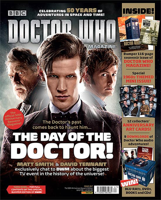
Title of Publication
The title of the magazine is Doctor Who which is also named after the drama series as well. The colour of the title is in a grey cloudy colour which is also the background colour. The head of Matt Smith (the doctor) covers the title slightly this shows that he is important and well known. It is placed on the top third so that it is easily visible. The cover image is familiar to the audiences therefore the title stands out.
Slogan
The slogan is in big and white writing, it's catchy and it is meant to stick in the readers mind. It sums up the magazines image as it covers the medium main picture.
Central Image
Most magazines tend to employ a single image whereas this magazine has one centre image and 2 people around him. The look on Matt Smith's face is serious and straight. The centre image which is of the doctor is a strong central image which servers to anchor the cover which provides it with weight and focus. Matt Smith is gazing into the camera so are the other 2 people on the magazine cover. This shows the audience that the people on the magazine are directly addressing them.
Free offer
Magazines sometimes come with free small gifts. In this Doctor Who magazine, there is a competition which reads 'competition win free gifts such as DVD's and Blue Ray DVD's' this is to persuade the audience more into buying the magazine as they are getting something free out of it which audiences like. This gift is closely targeted at the magazines core consumers.
Cover Lines
Once the main image or images are placed on the background, the cover lines will be strategically placed around it so as to advertise the contents of the magazine. In this magazine all the cover lines are placed in the middle rather than most magazines which place their cover lines around the picture. The main cover line is always and most likely in bold and large writing, this usually connects with the central image.
No comments:
Post a Comment